beyond the plateau
Find the discussion on Linkedin or Bluesky.
Mar 28, 2025
This is part of a trilogy on the state of our industry:
I started working on this trilogy because I was trying to make sense of where our industry is heading. In the last few years, I have been seeing less and less of the type of work I used to make, the type of bespoke data visualizations that I used to be so inspired by. The tingly spidey senses came to a crescendo last year when my favorite long-term client cut out the only custom visualization I had designed for them, and I delivered a report with a line chart, bar chart, and pie chart. I was starting to wonder if my type of work was falling out of fashion, if this was the writing on the wall.
The type of bespoke data visualizations I used to make, including "An Interactive Visualization of Every Line in Hamilton" (2016, left) and "hong kong artists, women" (2020, right).
In an attempt to adapt and ensure the longevity of my business, I asked some highly respected voices of our industry, all of whom I admire for their beautiful, bespoke work that they’ve created over the years. From my conversations with them I put together a recap of our industry’s recent history, (cheekily titled) “What killed innovation?”, which explores the plateau of creativity that so many of us are experiencing now.
What I’ve learned from putting that blog post out into the world is that it uses a very narrow definition of “innovation” — one that is inherently technical and specific to the decade in which I joined the field. But we’re halfway into a whole new decade, and the field looks very, very different now from when I first joined. So where do we go from here?
Before I dive into it, I’d like to thank the amazing friends and industry colleagues that took the time and effort to chat with me: Pei Ying Loh, Andy Kirk, Jason Forrest, Nadieh Bremer, Giorgia Lupi, Federica Fragapane, Caitlin Ralph, Matt Daniels, RJ Andrews, Alberto Cairo, Eric William Lin, and Moritz Stefaner. Many thanks as well to those who took the time to respond to my previous post. Their feedback was invaluable in helping shape my thoughts for this one.
Consolidators, experimenters, and many more
In my conversation with Alberto, he was quick to point out that as the industry has grown, there has been a corresponding increase in different roles. “There is a need for everyone in this community,” he says “There are people who are pushing forward, people who are pushing backwards, people who are wary, people who are more open to experimentation. We need that diversity.”
He contextualized himself as a consolidator (which I interpret as someone interested in bringing the community and practice together), and for him, it’s a very exciting time as more and more people come into the field. Amanda Makulec, in her response to my previous blog post, agrees: “In a time when there’s so much uncertainty and disruption, I feel like the ‘plateau of productivity’ (what Gartner hype cycles call the period when a tech or approach is widely adopted and used) is almost comforting to me.”
And indeed, for both Alberto and Amanda, technical innovation (from software and coding tools to charting techniques and creative styles) isn’t their primary marker of progress. Instead, the innovation they are working towards is in data literacy and accessibility. Alberto hopes “that the user base, the reader base, will become wider and broader, but also will have a deeper knowledge of how to read charts. To me, that’s the true goal.”
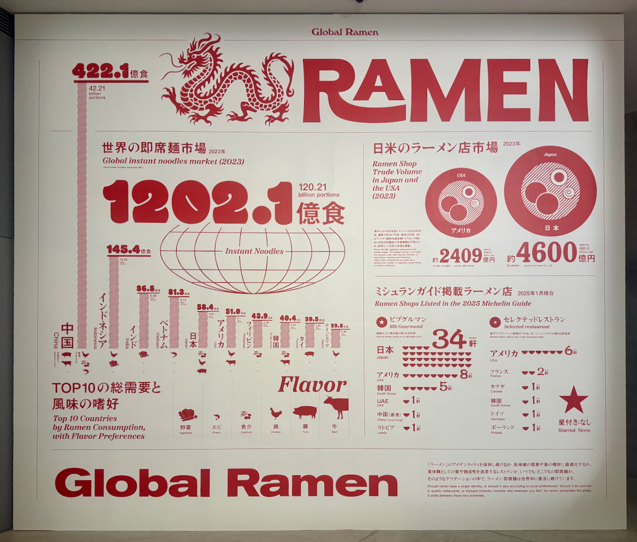
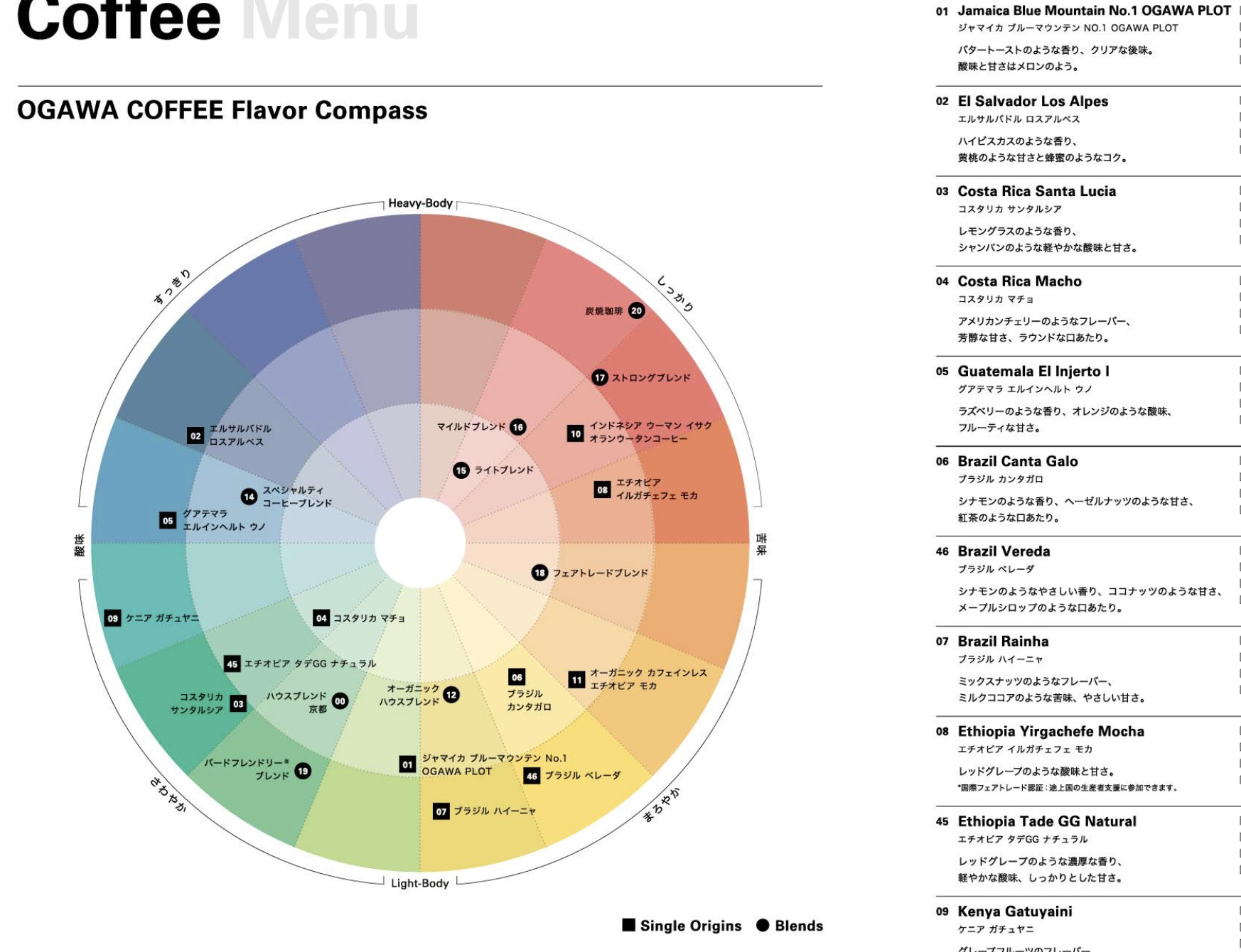
We talk a lot about charts becoming ubiquitous in our lives. “Closing the ring” on our Apple Watches is one example , but I also want to present this delightful bar chart I found in 21_21 Design Sight Tokyo’s recent exhibition, “The Art of the Ramen Bowl: Ramen x Design Analysis Starting from the Bowl.” (left) And all the coffee shops in Tokyo plotting their beans on a scale of sour to bitter and light to heavy — this one’s from Ogawa Coffee Lab (right, image credit Ogawa Coffee Lab), and I still haven’t figured out if the radius means anything, or if it’s just a scatterplot that they just decided to put in a circle. 😂
I’d imagine that as our field expands even more, we will see many more roles emerge, each with its own priorities and goals and innovations. That, I think, is a very exciting prospect for our field.
But let’s get back to me. 😂
I see myself as an experimenter, motivated very much by novelty and pushing the boundaries of what is possible. So where do I find my next inspiration?
Broadening and redefining
For years, I described data visualization work to be along a gradient between expository projects (led by newsrooms) and exploratory projects (most commonly found in business analytic tools). A lot of the web-based innovations have occurred within these two contexts in the last two decades, and as I explored in my last post, we’ve hit a point of maturation for how we present data on the web and are now in a phase of iterative refinement.
The Information is Beautiful Awards lumps everything outside of those two contexts into just “Unusual.” At first glance, the category seems like a hodgepodge of entries: I’ve seen everything from data sculptures, to sonifications, to textile and fashion ventures, to AR/VR projects. But in the last few years, the “Unusual” category is also where I’ve found the most inspiration. And perhaps not coincidentally, several people I spoke to pointed to these areas as potential “unexpected” places where our medium can expand into.
My guess is that we lump them all under “Unusual” because we don’t consider them traditional “data visualizations.” They don’t always have the telltale geometric marks and visual channels that have been ingrained into us. But if our goal as data communicators is to drive conversation, then as long as the data collection and analysis is rigorous, does it matter if the piece uses rectangles and circles, or whether it looks like a chart?
Some of my favorite projects from the "Unusual" category:
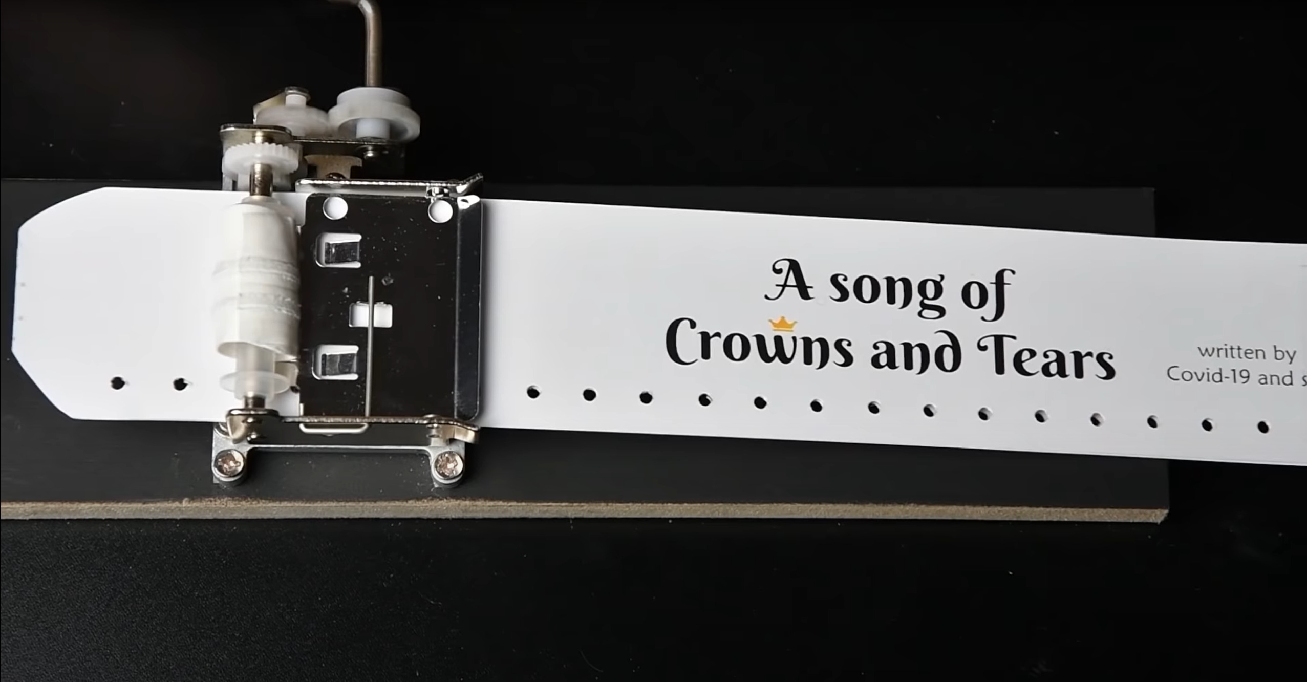
A Song of Crowns and Tears sonifies COVID-19 deaths in Switzerland in an attempt to bring humanity and emotion back to the numbers (top left, image credit, Simon Huwiler).
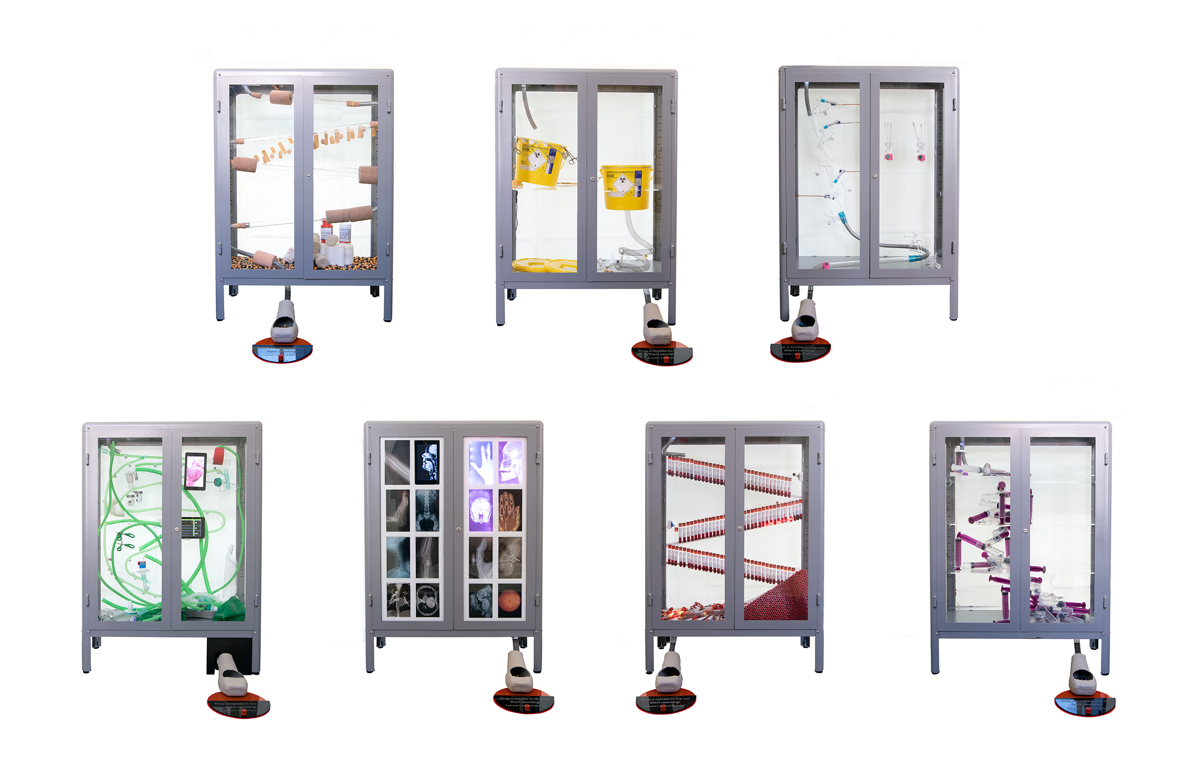
The Long Run is a kinetic installation that represents "the cost of health care for different age groups, based on the time it takes for a marble to fall", created for the 70th anniversary of U.K.'s National Health Services (top right, image credit, The BMA).
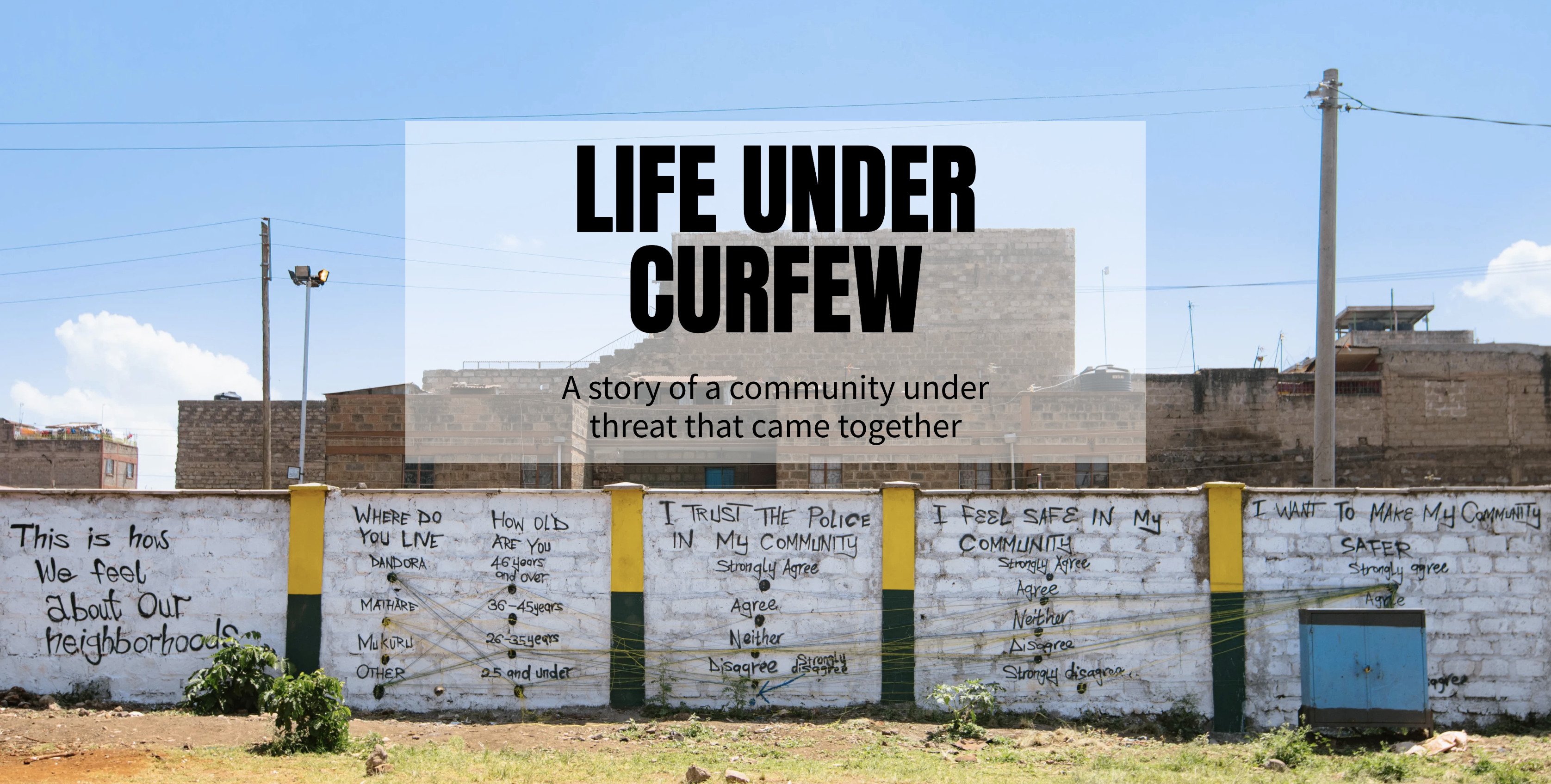
Life Under Curfew is a (simultaneously gut-wrenching and heart-warming) community-led data mural in Nairobi’s Dandora neighborhood, documenting human rights violations and acts of solidarity during Kenya’s COVID-19 curfews (bottom, image credit, Social Justice Centre Working Group).
If we want to push our creativity forward, we need to broaden our scope of “proper” data visualization, or even our scope of data art. In fact, I am convinced that what we currently consider “Unusual” will drive our next cycle of experimentation and innovation.
But Shirley, you might say, the “Unusual” category encompasses sonifications, physicalizations, smellifications. Those aren’t data visualizations. And you’re absolutely right.
Which is why I want to take it one step further: not only do we need to broaden our scope, but we also need to redefine what we stand for.
Recently, I’ve become a fan of the term “data experiences.”
Data experiences
The Merriam-Webster dictionary defines “experience” as “(noun) direct observation of or participation in events as a basis of knowledge,” or even better, “something personally encountered, undergone, or lived through.”
So I’m defining data experience as anything that enables us to personally encounter data as a way to expand our personal and collective knowledge. I like this definition because it is intentionally broad and inclusive. It can contain within it data visualizations, sonifications, physicalizations, smellifications, or things we have yet to define and be inspired by.
Personally, the data experience I’m most interested in is data-informed art that takes physical form, as data sculptures, room-sized installations, or even public art works do. Though we now have a set of conventions for web-based data experiences, there’s still limitless possibilities in how we present data in physical space. What senses can we activate? (Smell? Touch? Taste??) What materials and mediums can we use to call back to our dataset and topic? How can the participant move through or around our pieces? What is the relationship between the location of the data experience and the topic it explores?
And perhaps even more importantly, I’m excited by the potential for physical art to unlock data experiences that the web cannot. When I express data in the physical world, the result is noisier and messier, which lends itself really well to imperfect, incomplete, or even very emotional data that we have a lot of trouble visualizing in the pixel perfection of a screen. That imperfection resonates because it feels so human.
My forays into physical data experiences.
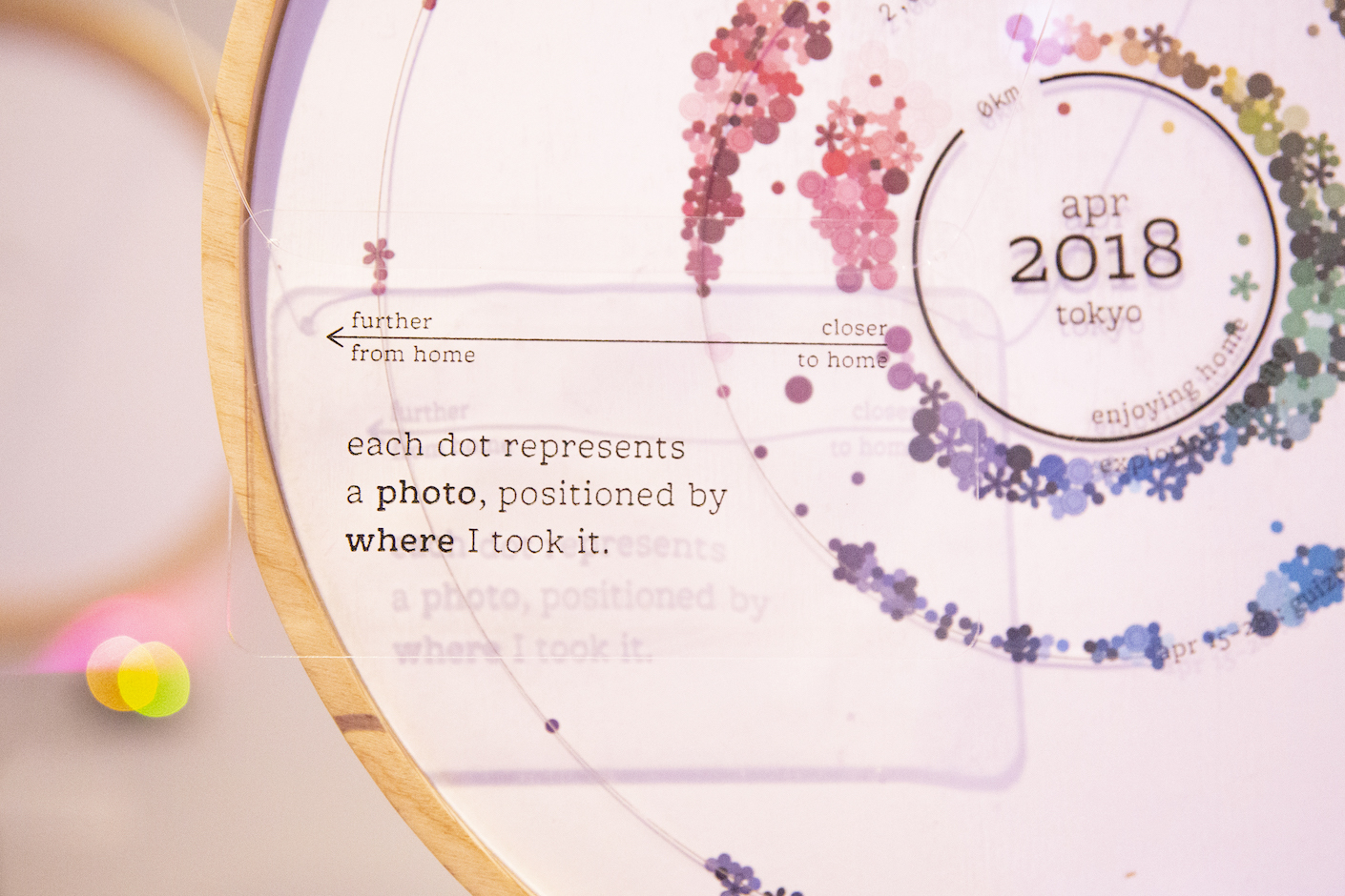
"wonder" (2022) is a room-scale installation that consists of a data visualization of photos I took between 2018 and 2022, and whether they were taken at home or outside (top left). I projected the visualization over a bowl of water, and dripped water according to the number of Covid cases in that same time frame (top right). It was my attempt at expressing how distorted reality felt during the pandemic.
"though a patriarchy would privilege the changelessness of the sun over the inconstancy of the moon and you" (2022) is a data sculpture that drips red ink via a copper tube. Each drop represents a day I menstruated in 2020, and lands on an acrylic plate numbered 1–31 (for each day of the month), while a circular wooden plate rotates through the corresponding lunar phases (bottom). I wanted to use material to highlight the synthetic, manmade concept of time, versus nature's way of keeping time.
Sarah Emery Clark, in her response to my last post, summarizes it best: “We connect more deeply to information when it’s in relationship with our physical experiences. We process differently — connecting the dots — when ‘doing’ and ‘thinking’ happen simultaneously.”
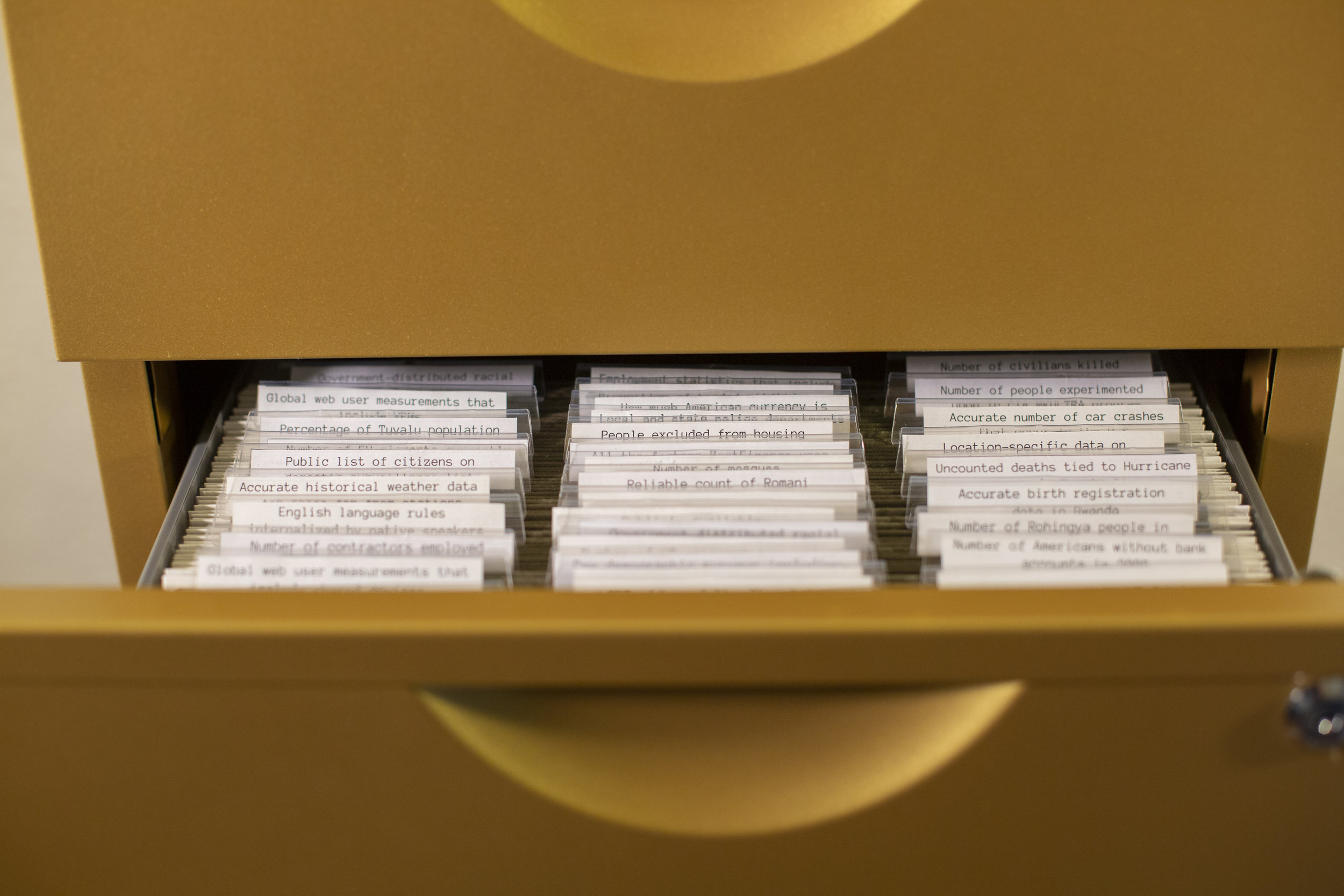
There’s a lot of exciting work already happening in this area. I’d be remiss to not mention Ekene Ijeoma’s Wage Islands — my very first encounter with a physical data experience. In Wage Islands, a 3D printed map of Manhattan is submerged in black water, and as the participant enters their hourly wage, the water rises or lowers to reveal the parts of Manhattan where they have access to housing. There’s also Adrien Segal’s Snow Water Equivalent, a wooden cabinet where each drawer’s height is mapped to total annual precipitation. The drawers are a metaphor for ground snow, which is nature’s water storage: “the less water available in the snowpack, the less space available in the drawer.” And finally, Mimi Onuoha’s The Library of Missing Datasets 2.0, which subverts our expectations of what a data experience should look like. It is a filing cabinet filled with empty folders, each labeled with a dataset that should exist, but doesn’t.
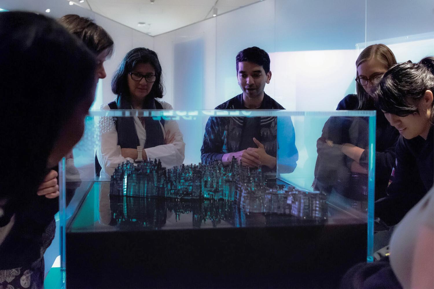
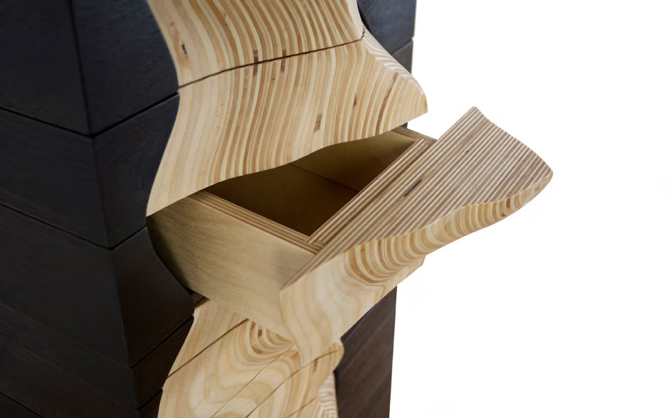
Ekene Ijeoma’s Wage Islands (top left), Adrien Segal’s Snow Water Equivalent (top right), and Mimi Onuoha’s The Library of Missing Datasets 2.0 (bottom). All image credits to the original artists.
None of these works look like what we traditionally consider to be data visualizations, and indeed, none of these artists consider themselves to be data artists. But their works are thought-provoking and poetic, and a continued source of personal inspiration.
The elephant in the room
Ok, I want to acknowledge: I probably sound removed from reality, suggesting art as the way forward. Art is hardly financially sustainable in the best of economies, and we (at least in America) are experiencing a very uncertain economy, with tech and newsroom layoffs happening more frequently, and government agencies getting cut left and right.
Currently, my client work is funding my art work. I’m investing my own time and resources to discover my personal style of data and physical art, and to prove their vast potential as cultural artifacts. But I know I’m in a very lucky position to be able to strive for this, and I never want to promote free labor as a solution to anything.
All of this to say: I don’t claim to have a good answer. In fact, I’m soliciting suggestions.
Cultural impact
Thus far, I’ve been talking a lot about innovation and inspiration, but I want to take a step back and ask: what even drives innovation, and what are we innovating for?
This line from Eric lives rent-free in my mind: “For a product or project to have influence — both on the industry [level] and in the public’s mind — many people have to be able to see it and experience it. Data storytelling is ultimately a cultural product, and cultural products require some amount of audience reach, and a number of subsequent activities that follow like discussion, conversation, and debate, in order for that cultural product to have meaningful cultural impact.”
I want to extrapolate further: Mass audience reach allows creators to receive feedback at a larger and more frequent scale, allowing them to iterate based on those discussions, and ultimately try new innovations. Innovation fuels cultural impact, which fuels innovation.
So then the question becomes: what does cultural impact look like for data experiences, and particularly for physical art?
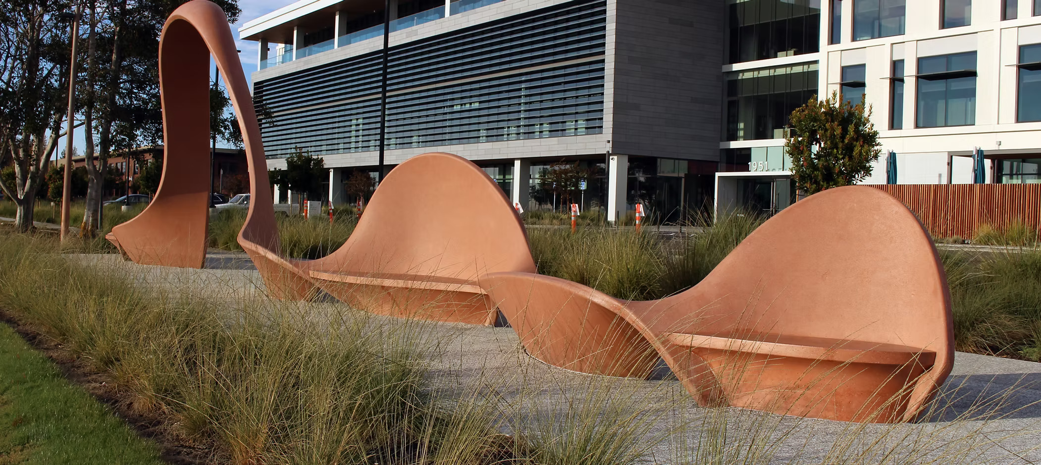
Adrien Segal’s Tidal Arch in the City of Alameda is inspired by the shape of daily tide charts.
At first, I thought of art museums and public art as avenues with potential mass audience reach. But it’s hard for artists to actually show work in museums or even art galleries, and public art requires millions of dollars in funding. Unlike digital pieces on the web, the physical art world has a high barrier to entry. And even if we’re able to get into the museums and galleries, physical works are still inherently exclusive from an audience perspective: Only a small group of people in the whole world can ever experience them in their fullness.
But I think that’s a feature not a bug — if we design our data experiences for a hyper-local community.
Recently, Kontinentalist updated its mission and vision. Pei Ying tells me, “instead of calling ourselves a data-driven editorial studio, we are now a studio that offers data and human experiences. We didn’t want to call it ‘representation’ anymore or ‘physicalization.’ Very often it is just […] very much an emotive experience.” She continues, “for one of the [events] we did, we used flowers to talk about ancestry. So [the participants] pick the flower that represents their ancestry. And then we get them to respond, why did you pick this flower?”
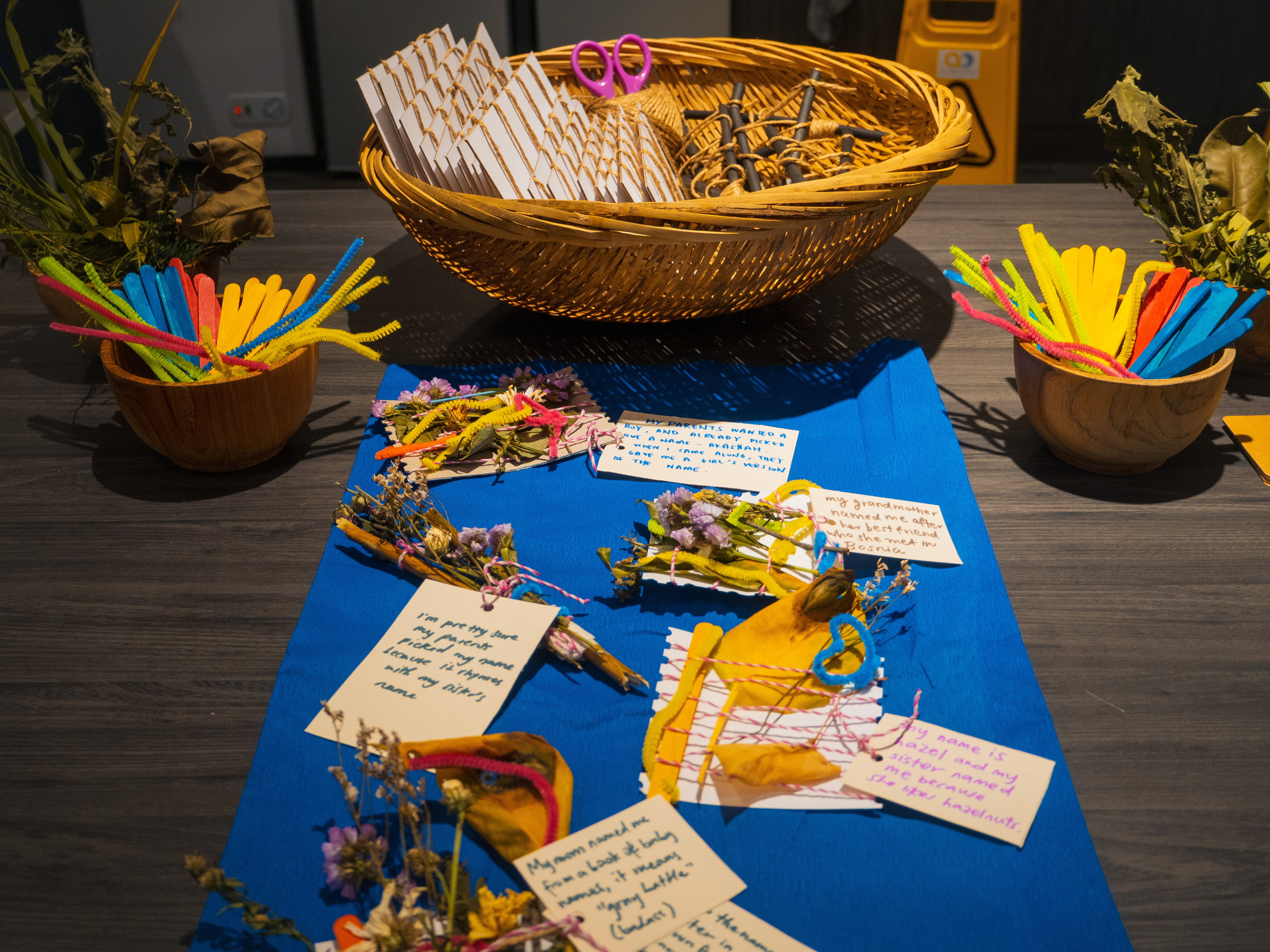

From Pei Ying:
"For our New Year’s Dinner Party this year, we wanted to do a data physicalization activity that resonated with the theme of Roots That Reach. We created an activity called “In Your Nature”, where participants could make use of flowers, leaves and plants to create a kind of weaving or mini bouquet that reflects who they are as people and the communities that have shaped them. For example, the use of different colours corresponded to how their communities formed closer bonds (green = practising rituals, pink = doing new things, etc.), and they could also share the backstories behind their names."
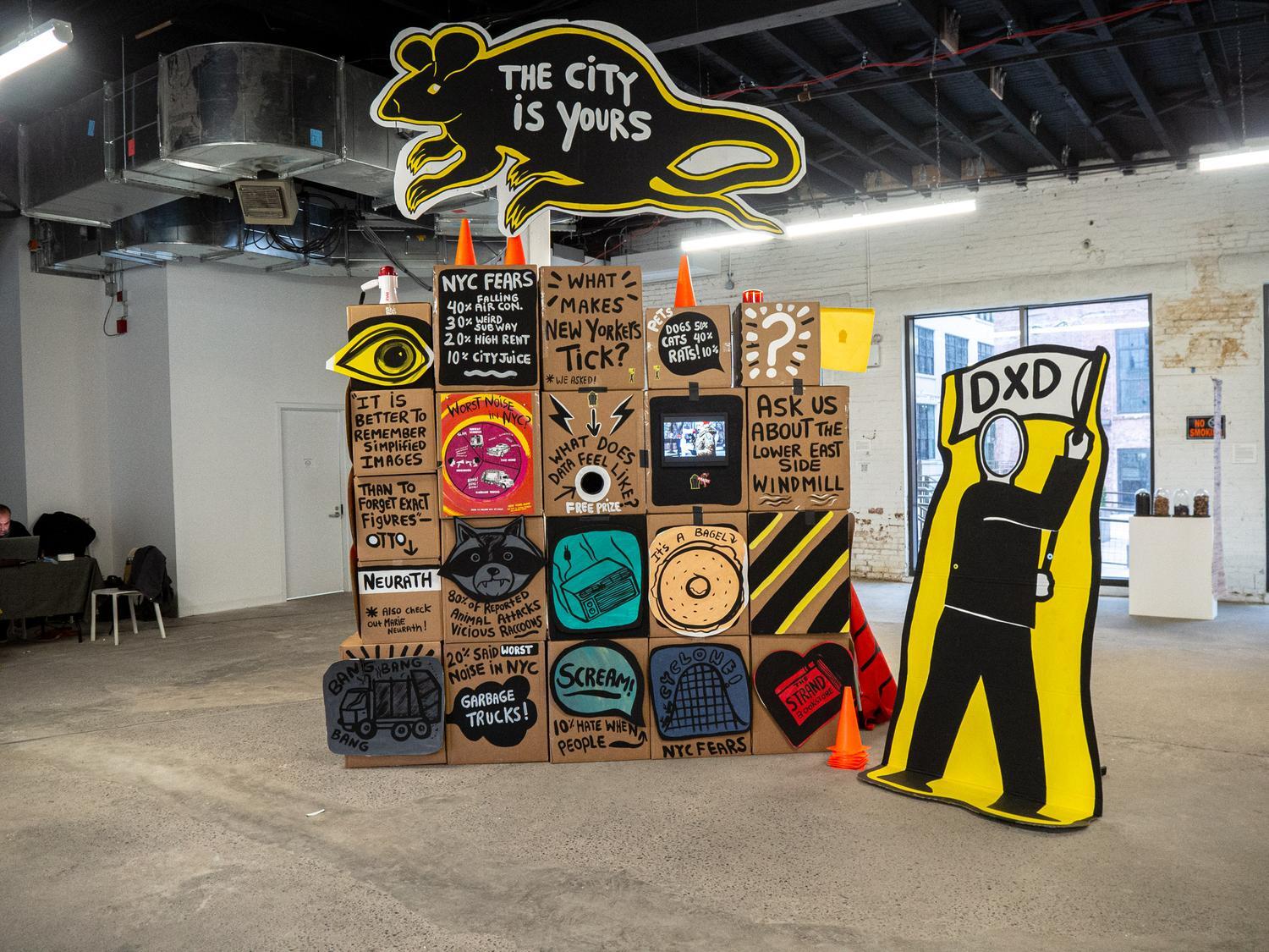
Data Vandals started out by putting up temporary cardboard sculptures in public spaces in New York City. On the cardboard boxes were a series of NYC-specific questions and answers covering everything from pets (50% dogs, 40% cats, 10% rats) to fears (40% falling air conditioners, 10% city juice). They’re hilarious, and you bet they sparked conversations.
I’d imagine that picking flowers to talk about ancestry or discussing rodent pets next to a cardboard sculpture might not appeal to everyone. But for the communities that these events were designed for, they were surely impactful.
Which is why I’m convinced that cultural impact doesn’t have to be just about quantity. It can also be about quality. I’m looking forward to this next decade of innovating on physical data experiences, of bringing people and communities together for meaningful engagement and connection.
The other elephant in the room
When we talk about (technical) innovation, it’s hard to not bring up AI. Indeed, I’m looking forward to how LLMs and AI Agents (?) will change the way that we work with data — especially with how we collect and analyze qualitative data. But I’m largely uninterested in AI as a driver for art and innovation.
My disinterest is best described by Alberto as he recalled innovation in the late-1990 newsrooms: “At least in my case, the technology really didn’t drive the innovation. The ideas did, right? The technology was essentially a way to allow that, to enable those ideas to become physical, to gain reality.”
The ideas drive innovation, the technology only enables them.