Low Wage Does Not Mean Low Skill
Pathways to Mobility for 24 Million Workers Skilled Through Alternative Routes
Client: Opportunity @ Work
The Challenge
Opportunity@Work is a nonprofit that advocates for STARs (workers who are Skilled Through Alternative Routes). These workers are often thought of as “unskilled” or “low-skilled” because of their lack of a higher level education. But the organization demonstrated through detailed studies and analytical reports, that STARs possess relevant skills that can greatly advance their career pathways.
As the organization was preparing to work with a new funder, it wanted a fresh way to convey their data insights—a way that could capture layers of complex data in a meaningful, easy-to-understand, and more engaging format. The goal was to visually show how STAR workers from many different industries apply their skills to bolster their economic mobility. “We can put a ton of data onto the world to show skills, but we know that data alone isn’t persuasive,” says Amy Mortimer, Senior Director of Insights. “Our challenge is always taking this data and elevating insight, helping people see the world in a way that we want them to see it. We wanted to change the way our potential funder was thinking about this problem.”
The Data
- Public U.S. Census data in raw format with metrics including education, occupations, job transitions, and many demographic slices.
- Charts and slide decks from the team’s prior analyses.
The Execution
The project took two months and included an analysis phase, a sketching and designing phase, and a technical implementation phase.

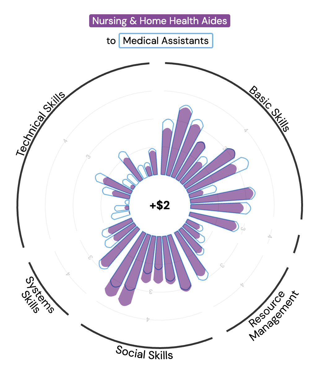
The original seven-pointed star that served as the inspiration (top left) for the "flower" visualization that showed skill overlap between two occupations (top right), and the "lilypad" visualization showing historical transitions between origin, gateway, and destination occupations (bottom).
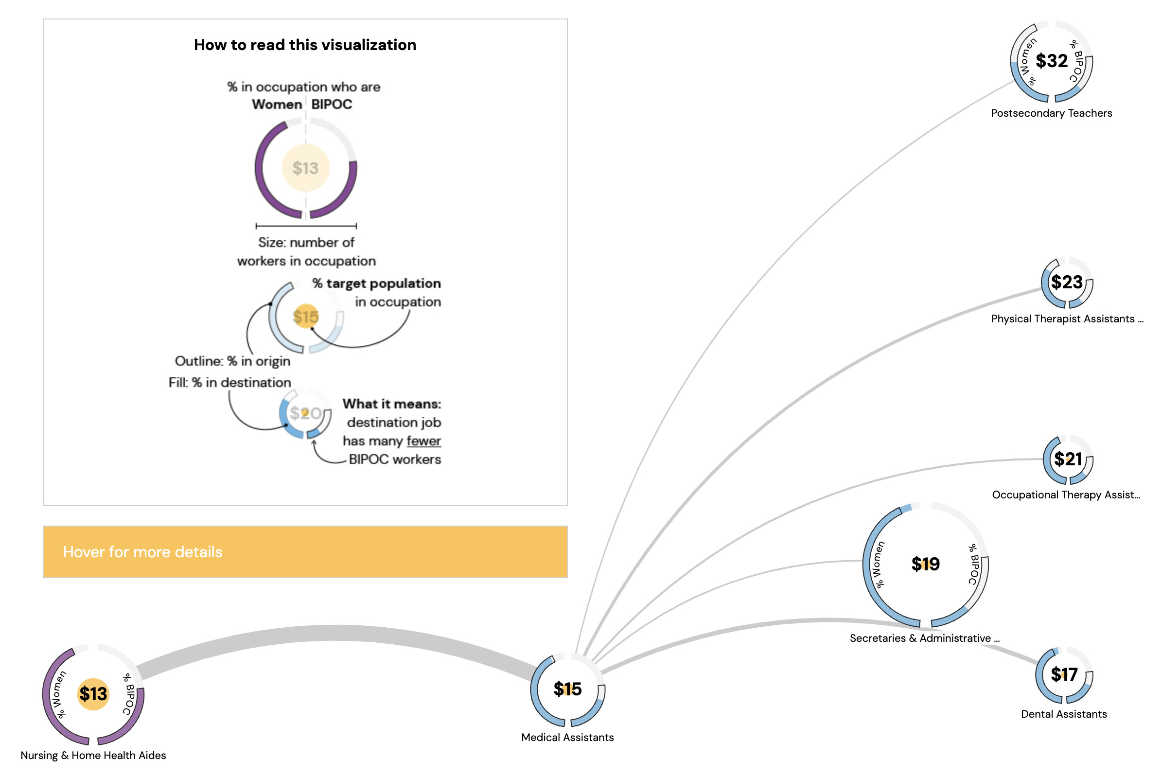
During the analysis phase, the team had to figure out which metrics were most important to tell the story. We wanted to integrate data about the job skills, job transitions, and worker demographics to show how workers move from job to job based on skills. These metrics then informed the design possibilities. We relied heavily on visual metaphors: the main visual was inspired by the client’s preliminary picture of the argument, a seven-pointed star, which described the overlap in skills between two occupations. We also came up with a “lilypad” design, where each lilypad described an occupation’s demographic information, and the lines (or “hops”) between them illustrated the number of transitions.
In order to optimize web performance, we stripped the data set down to just the necessary metrics for the visualizations. For the final web page, we used D3.js, Vue.js, and Greensock Animation Platform.
The Result
The final product was a multi-part interactive visualization that caters to readers at every level of interest. Readers who want the topline insights can simply scroll down the webpage to see how one group of STARs (nursing and home health aides) can find paths to higher-wage jobs. This format, known as “scrollytelling,” uses visual diagrams to convey complex information in a digestible, engaging, and story-like way.
For the more curious reader, the bottom of the webpage features an exploratory tool where they can select from over 400 occupations to see the related skills, job pathways, and wages. And the most detailed readers have the ability to hover over the interactive elements to see the size and demographic makeup of that workforce. In this respect, the final product is truly a choose-you-own-adventure story, allowing the reader to engage and learn as much as they want about the STARs.
“The beauty of this tool was that we were able to make a complicated argument come to life,” says Amy. “This tool was something that our audience could come back to. It was more durable than just having a meeting. And the process of building it with Shirley actually advanced my own thinking about our data.”
The funder began to fund Opportunity@Work and became a long-term funding partner for the nonprofit.